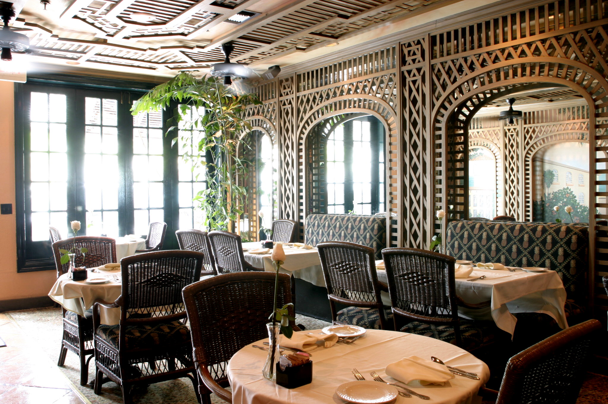
Inspiration and the city: Taboo {Palm Beach}

Happy Friday darling readers, Dina here, back from my fabulous vacation in Palm Beach Florida, where I have been escaping the New York Cold. While New York is fabulous, I consider Florida my second home and it just would not be fair for me not to share one of my favorite spots down south with all of you...


When I stay in Palm Beach, Taboo is my go to brunch spot.
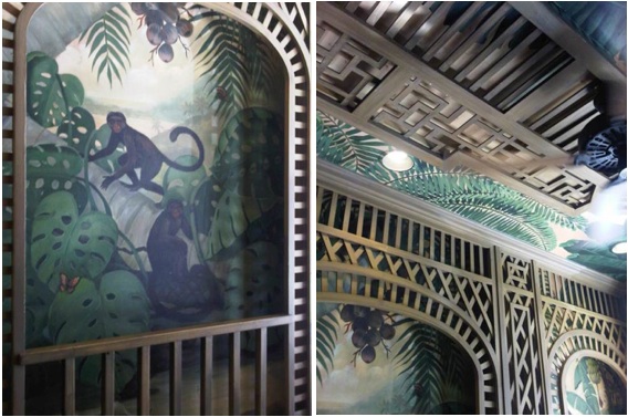
 Besides the fact that I love everything on the menu (and this is perhaps the best spot in all of Palm Beach for people watching), the decor captivates me every time I visit. The atmosphere at Taboo encompasses a little old school glamour while keeping the palm beach vibe, an utterly chic + vivacious combination. I would love to recreate the vibe at home, preferably the dining room and here are a few ways I would do it...
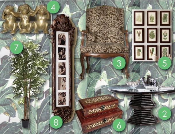

1.   I'd start with the notorious Beverly Hills hotel Wallpaper
2.   A bamboo round Dining Table
3.   leopard evokes that exotic feel and I love this Dining Chair
4.   what would it be without brass Monkey Statutes
5.   Several bunches of Botanical Prints
7.   Why, Faux Palm Trees of course
8.   To top it all off with a bit of glam and romance I'd fill family photos in this Collage Frame

xoxo

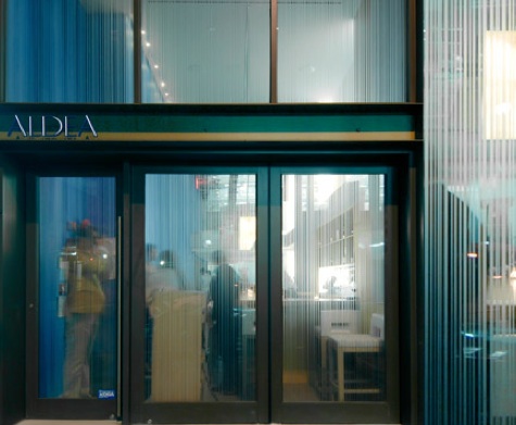
Inspiration and the city...ALDEA {NYC}

 Happy Friday lovely readers- Dina here, giving you the inside scoop on yet another delectably decorated New York City venue...
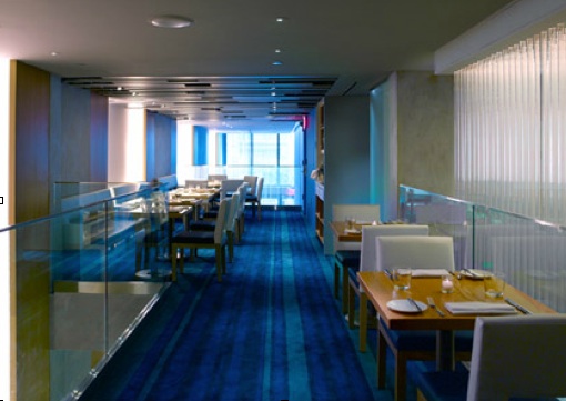
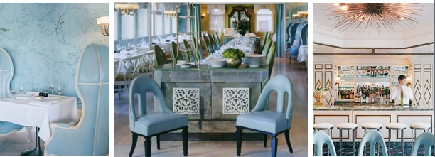
Today, I am featuring Aldea, a restaurant although not so well known, well revered by those who are lucky enough to have discovered it. This George Mendes restaurant is definitely a must go for those who enjoy a fine dinner much like myself (insider tip: warm maine lobster with artichoke, vadouvan butter, vanilla-pineapple) and appreciate fine décor to compliment the palette. The restaurant is thoroughly decorated in rich blue hues, which in my book automatically elicits memories of the ocean & relaxation.
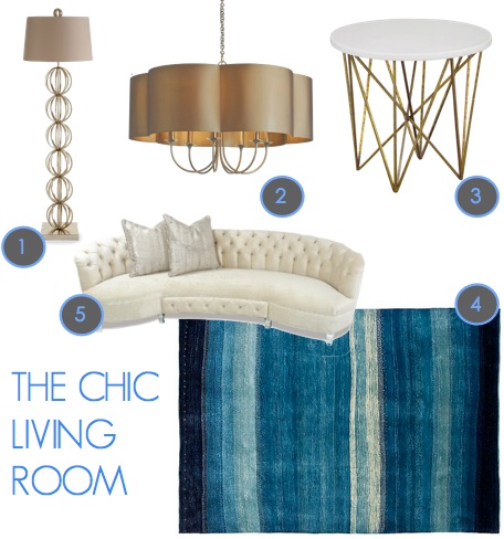
By doing some research I learned that “Aldea's interior tells a story of the inherent beauty of the countryside of the Iberian Coast” and was meant to inspire images of Water, Air, Wind, Clouds, Sky and Earth, Stone, Wood. I love a well thought out design, it completely inspires me to redecorate! So, below are my picks to help incorporate and inspire the same themes in your home- I think the rug matches almost exactly to the carpet in the restaurant! Wouldn't you agree?


1. Floor Lamp | Arteriors 
2. Chandelier | Arteriors
3. Oly | Side Table

Inspiration and the city: NYC The Lambs Club


Happy Friday lovely readers- It's Dina, reporting to you about our latest outing at The Lambs Club...
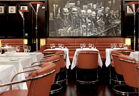
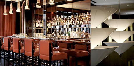
 V&M threw a lovely event honoring their InSiders and Ashlina was one of them! The party was fabulous, sophisticated and so swanky, (see inside the event here). The Lamb’s Club opened last year and the reviews were all about the decor (I discovered for myself that the dinner menu was delicious as well- I highly suggest the Lobster Bisque and all the sides- especially the Roasted Cauliflower). I am not sure what I liked more- the black walls, the red dinner chairs, or the black and white vintage prints adorning the entire restaurant (Grace Kelly, JFK, all the oldies but goodies). But wait! The Lamb’s Club, which is nestled in The Chatwal Hotel (a Starwood Hotel) is right on 44th Street making it a pre-theater must (so very New York) and the hotel has managed to take the decor of the Lambs Club and extend it to the lobby bar, the upstairs bar- basically throughout the hotel, so the deco glam is EVERYWHERE- as if the 30’s never ended. Below see how I would recreate  the Lamb’s Club Atmosphere in my home:


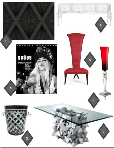
1.Wallpaper | Romo | Laurito Flock Wallcovering Ebony
Romo wallpaper is just beyond words. 
2.Champagne Bucket | Black Cased Crystal Champagne Bucket
Black and White Crystal combined to make a champagne bucket and for under $300.
3.Dining Table | Delauney Steel Dining Table
VDB only make a very limited # of these glam tables, definitely a coveted piece. 
4.Lucite credenza | Craig Van Den Brulle
 Lucite is the best thing to make a blast from the past and this credenza is just the ultimate lucite piece
5.Dining Room Chair | Christopher Guy
Christopher Guy is simply a genius. His furniture manages to take on a life of its own- if this chair was human it would totally be a Marilyn. 
6.Coffee Table Book of Vintage Prints | Patrick McMullen | So80s:A Photographic Diary of a Decade 
7.Tableware | Baccarat- Ruby 
Just imagine storing it on that lucite credenza!
xoxo


Inspiration and the city: NYC's APOTHEKE


Happy Friday lovely readers! As we have all heard, New York is the city that never sleeps, so you can just imagine...
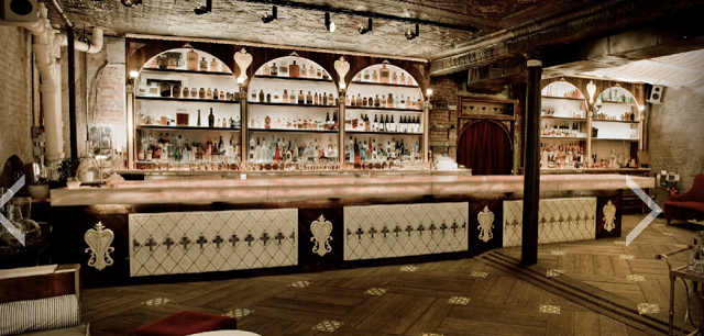
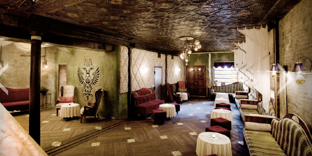
my delight as I stepped into this swanky lounge in the heart of Chinatown. I was completely overwhelmed to see that we had stepped into a darkly lit lounge/bar decorated with striped green and white settees, red velvet ottomans and overpowered by an entire wall of bar made out of white Carrera marble and decorated with hundreds of antique medicine bottles. 
This fabulous gem is the one and only Apotheke. While these pictures barely do justice to preserving the atmosphere of Apotheke (a major part of the experience are the drinks, and I highly suggest you start off with the Strawberry Fennel (fennel-infused vodka with California strawberries soaked in orange liquor, fennel oil essence- beyond DIVINE) the décor which was inspired by European apothecaries absinthe dens, and the Biedermeier design era can be re-created with some of my picks below.  

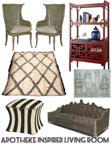
1)We can start with the perfect vintage bookcase
2)Then, This Casablanca sofa is a no brainer. For the purposes of this post it would need to be reupholstered in deep red almost maroon velvet and the more “worn” looking the better. Brass nail heads of course and dark wood legs please.
3)I really love that the settees at Apotheke are striped. While the green and white combination wouldn’t translate as well into the home, I would love to incorporate the stripes but with an ottoman like this. Black and white would be so sharp with the velvet sofa.
4)The flooring at Apotheke is rather detailed with tile inserts. I am a big lover of dark hardwood floors but also thing a rug is a greaty way to not only tie in all the elements in the room but to just add warmth. This Moroccan Rug could never go out of style. 
 5)Note the 2 caned wing back chairs in the corner of Apotheke. Caned Wing Back Chairs |  love the shape, I would just reupholster the pillows.
6)Apotheke is so unique because it has this mystical vintage feel to it. Like you stepped back into time. Antique bottles add personality and that similar feel. 
xoxo

NYC Fabulosity Friday: BG at Bergdorf Goodman

Happy Friday Lovely Readers! 
Its no secret that as far as fashion and shopping goes, New York gives all the cities a run for their money. As an avid little shopper, I find I work up quite an appetite after a long day of browsing the racks. Besides being a mecca to girl’s like me with MAH-JOR shopping addiction’s, Bergdorf Goodman’s 7th floor restaurant, BG is just another reason (and there are many) as to why Bergdorf’s is my ultimate fave fabulous place to shop in the city. INSIDER TIP: the lobster mac and cheese which is absolutely divine & will keep you full for hours and if you stop in between the hours of 3:00-5:00pm be sure to opt for the Bg Tea Service: think high tea served Queen Elizabeth style- so decadent!.
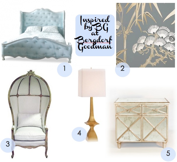
Designed by Kelly Wearstler, this four room space withsweeping views of Central Park is just constant eye-candy. I simply die over the baby blue bonnet chairs and the black and gold wall moldings. 
Take a look below to see this BG inspired bedroom...

1. HAUTE HOUSE | ARIEL BED
4. Amherst Satin Brass Lamp White Linen Shade with Diffuser 
5. WORLDS AWAY | HUMPHREY TWO DOOR


xoxo


MEET OUR NEW CONTRIBUTOR: DINA for NYC Fabulosity Friday


Morning lovely readers! My name is Dina and I am a design student here in New York. I am thrilled to share with you my decor perspective, starting today on my 
NYC Fabulousity Fridays. 
I'll be taking you on a personal decorista tour of the most fabulous city in the world....

As anyone who has ever spent more than a minute in New York can attest, this city is filled with fabulous. It is absolutely impossible to uncover all that is fab but I keep trying each week.  While Morgan will be covering couture and color I will be giving you updates on the amazingness taking place in New York and how this city continues to sharpen my design focus. 
For our first Fabulousity Friday I will be highlighting the infamous Rose Bar located too conveniently across the street from my apartment. Ian Schrager’s landmark hotel, The Gramercy Park Hotel hosts this fabulous lounge/bar where Rose is a common theme in decor and drinks alike (insider tip: the Rose and Lychee Martini is a must). 

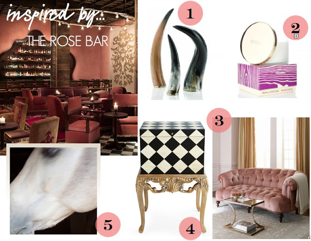
My following fabulous finds for the week have all been inspired by the Rose Bar in one way or another. 

HOW TO RE CREATE THIS FEEL IN YOUR SPACE:
  1. Horns | While Rose bar is dominated by pink tones and cushy velvet, the bar still maintains a masculine feel making it a popular destination for both genders. Horns similarly are an excellent accessory to add masculinity to any space.
  2. Balinese Woods | Rose Bar is by far the sexiest destination in NYC, the place even smells sexy and I am not quite sure how to explain that, but I recently discovered Balinese Woods by Burn. The smell is intoxicating. Although Peony Blanche by Nest has been a longtime favorite I have been overcome by Balinese Woods AND it reminds me of Rose Bar.
  3. Tufted Blush Pink Velvet Sofa | This upholstered sofa is so glam and so versatile (pink? versatile- its true!). The soft blush color makes it an easy piece to pair with soft yellows and greys for a mature look or pale lilacs for a more girly ambiance. Add mirrored furniture to glam it up or accessorize with golds and brass to tone down the “girly” stereotype that pink is associated with. 
  4. Checkered file box | If you noticed in the image of the Gramercy Park Hotel, the floors are checkered black and white almost identical to the file box. The Rose Bar incorporates so many different textures, materials, shades, and elements yet the mix is totally ethereal- I am all about doing the same in the home to create ultimate domestic bliss. This file box is totally practical and fun to look at.
  5. Horse Photo | The Rose Bar is constantly circulating artwork although one can always spot a Warhol somewhere within. I recently discovered that Shine by SHO has a lovely collection of unique photographs. This horse one may be my favorite. 
See you all next week! Love,